ShopDreamUp AI ArtDreamUp

Deviation Actions


Description
What more do you expect from me...? There's nothing left here to burn! There's nothing left here to burn!! I've given you every part of me, there's nothing left here to burn!!
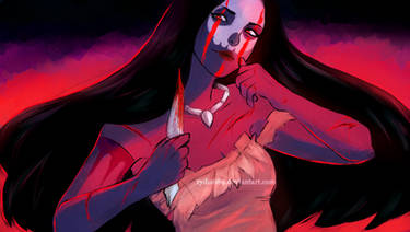
I This my entry to the Chinese Horoscope Contest held by the lovely ^SamuelRaffa over at #communityrelations!
My horoscope was Red Tiger !
!
虎 Team Tiger are:
Enthusiastic, Optimistic, Courageous, Bold, Sociable, Energetic
-----------------
Volatile, Impulsive, Hot-Headed, Restless, Disobedient, Vain, Stubborn
I tried to represent the wildest side of Red Tigers! I am easily enraged though I seem so calm , sociable, optimistic and courageous! But I'm also impulsive and disobedient. It certainly fits me
  .
.
Wish me luck!
Drawn in SAI
Effects in Photoshop
I This my entry to the Chinese Horoscope Contest held by the lovely ^SamuelRaffa over at #communityrelations!
My horoscope was Red Tiger
虎 Team Tiger are:
Enthusiastic, Optimistic, Courageous, Bold, Sociable, Energetic
-----------------
Volatile, Impulsive, Hot-Headed, Restless, Disobedient, Vain, Stubborn
I tried to represent the wildest side of Red Tigers! I am easily enraged though I seem so calm
Wish me luck!
Drawn in SAI
Effects in Photoshop
Image size
3888x4775px 12.94 MB
© 2012 - 2024 rydi1689
Comments50
Join the community to add your comment. Already a deviant? Log In
No soy muy bueno dando criticas en ingles, ya que mi vocabulario no es muy basto en este tema, pero al ver que eres de habla hispana me anime a escribirla.
Sinceramente el diseño del personaje esta muy bien logrado, su pose y colores coinciden de maravilla y que sea un .PNG le da un buen toque estético, pero a mi parecer los tonos brillantes están bien, pero enceguece un poco, no obstante llama mas la atención y es solo una opinión, cuestión de gustos.
Estuve viendo tu galería antes de hacer la critica, y vi que este es tu estilo de coloreado, las sombras están muy bien. Los trazos oscuros del cabello están bien, le dan mas textura al igual que las lineas del rostro o el traje en si, en cambio a los brazos le faltan esa textura, tiene relieve pero esta entre la linea neutra.
Otra cosa que observe es que el personaje esta bien parado sobre el suelo, esto ayuda a que se vea mejor, puede ser un dibujo genial, pero si esta mal posicionado o con un movimiento muy raro se lo ve raro, como diciendo que esta bien, pero algo no concuerda.
Sin importar esta critica, eres buen artista y en tu información dice que eres profesional, yo simplemente soy un estudiante de historieta, pero espero que te sirva mi critica.